Should you show metrics on your status page? Here's when it makes sense


Status pages have come a long way from simple "we're down" notifications. They're a core part of incident communication and customer trust. From internal status pages that align teams to public status pages that deflect incoming support tickets, they are a critical tool for modern businesses.
In addition to real-time updates, many teams consider whether to display system performance metrics like uptime. Some teams also decide to show incident performance metrics such as MTTR (mean time to recovery) and MTBF (mean time between failures).
At Sorry™, we often encounter these questions: Should we show metrics on our status page? And if so, which metrics should we include?
There's no universal answer to those questions. There are scenarios where metrics can strengthen transparency and build trust, and others where they could backfire.
In this article, we'll explore why metrics matter and when to use them (and when not to). We'll also share best practices for including them on your status page and look at some real-world examples of status page metrics in the wild.
What are status page metrics?
In simple terms, status page metrics serve as numerical indicators of the performance of a platform. Metrics are usually shown as a quantity, a percentage, or a duration to give customers a sense of incident frequency, how long it takes to resolve incidents, and more.
They enable teams to provide better context on incidents and performance issues, helping to tell a more complete story and build trust with customers and prospects.
How are metrics generated?
One key distinction in the status page world is how your metrics are generated. Some platforms rely solely on automated monitoring tools. Others, like Sorry™, give you full control: you can base metrics on manual incident updates, integrations with monitoring tools, or through an API connection.
This matters because not every organization wants to expose raw monitoring data. Controlled metrics let you stay transparent on your terms.
Why status page metrics matter
When used well, metrics aren't just numbers, they're signals of reliability, responsiveness, and quality. They help add color to the entire incident story by shedding light on hard data.
The incident updates you write are qualitative, and your metrics are quantitative. Paired together, you can offer more clarity into your product or service's stability.
Metrics help you:
- Build trust: Showing key metrics like uptime or MTTR proves that you take availability seriously and aren't afraid to be held accountable. This goes a long way when it comes to attracting and retaining customers.
- Align expectations: Technical users (DevOps, SRE, IT) often expect this level of transparency. It's not a nice-to-have, it's table stakes.
- Demonstrate operational maturity: Public metrics show that you have the processes and monitoring tools in place to track reliability at a detailed level.
When metrics make sense
In the right circumstances, metrics like uptime, MTTR, and MTBF can strengthen customer confidence, reduce support tickets, and even become a selling point. But they're most valuable when relevant to your audience and backed by strong internal processes and reliable data sources.
Here's when status page metrics can be a strategic move:
You have a technical audience
Engineers and IT teams care about numbers. Metrics like uptime and MTTR help them assess risk and reliability without guessing. This helps them make informed decisions, whether they're running due diligence on a new vendor, preparing for a technical review, or responding to an incident. It shows that you're confident in your systems, that you're measuring what matters, and that you're not afraid to be held accountable.
Example: A cloud hosting provider displays uptime, response time, and resolution metrics by region and service on their status page. This level of detail builds trust with their technical audience, who rely on the data for operational decisions.
Your status page is part of a broader trust strategy
Your status page can be used outside of active incidents. Proactively using your status page can become a credibility asset. Sales teams can point to your status page during pitches or onboarding to demonstrate operational maturity, and marketing can use it to reinforce brand trust.
Example: A B2B SaaS company might link to their status page during the sales process to show off their reliability track record. Prospects who visit the page see consistent uptime and clear incident communication, which helps build trust before a contract is signed.
When you have confidence in your incident workflows
If your detection, response, and recovery processes are reliable, public metrics become an extension of your operational excellence. When consistently tracking incidents, communicating clearly, and resolving issues efficiently, metrics like MTTR and uptime prove how well your team performs under pressure.
Example: A company running a payments API might use MTTR on their status page to highlight how quickly they resolve service disruptions. By showing that their average time to recovery is under 30 minutes, they not only reassure existing users, they also reinforce reliability as a core differentiator during security assessments or vendor evaluations.
When metrics might not be worth it
Every company has different priorities and strategies that support its objectives. Transparency is great, but premature transparency can cause more harm than good. Just because you can share metrics doesn't mean you should. The goal is to build trust, not noise.
You may want to forgo including metrics on your status page in these scenarios:
Your audience isn't very technical
If your customers aren't familiar with MTTR or uptime percentages, publishing them could raise more questions than they answer, or even cause unnecessary concern. For example, an uptime of 99.5% might seem low to someone outside of the tech world, even though it's quite good. These metrics can lead to misinterpretations, support tickets, or anxiety without the right context.
Example: A consumer-facing mobile app might skip detailed MTTR and uptime metrics, opting instead to show simple status indicators like "All Systems Operational" or "Some Services Affected." This approach keeps communication clear without overwhelming their non-technical user base.
You don't have enough granularity
If your metrics are too high-level, they might not reflect actual customer experience. For instance, a single uptime metric that covers multiple regions might show 100% availability, while customers in specific regions are experiencing outages. This gap can erode trust faster than having no metrics at all.
Example: A nationwide cell phone company displays a single uptime metric on its status page that applies to only a subset of its customers. When a localized outage impacts the Midwest region, those customers are confused when they see 100% uptime on their status page. This disconnect then erodes trust.
Your internal processes are still evolving
If you're still fine-tuning your incident response process, publicly displaying metrics might expose incomplete or inconsistent data. For example, incomplete incident records, inconsistent resolution times, or gaps in monitoring can all lead to unreliable data. In these cases, waiting until your internal reliability signals are solid and trustworthy is often better.
Example: A startup in the fintech space launches a status page with automatic uptime reporting powered by basic monitoring tools. However, without a mature incident response process, the data often misses partial outages or falsely flags issues.
Common metrics to start with
If you decide metrics are right for your company (and your customers), here are some common metrics to start with:
- Uptime: This is the most familiar metric, representing how often your product is available. It's simple and reassuring when the number is high.
- MTTR (Mean Time To Recovery): How quickly you respond and recover from incidents. It indicates how mature your incident response process is.
- MTBF (Mean Time Between Failures): Indicates overall system stability and how often customers can expect incidents to occur.
Best practices for displaying metrics on your status page
Before you start adding metrics to your status page, consider these tips:
- Don't show metrics for every single component. Too much data can overwhelm your customers, and let's be honest, do you need to show the uptime percentage of your marketing website? Probably not.
- Don't confuse metrics with SLAs. A metric is a performance record, and an SLA is a contract. Public metrics are about trust. They signal transparency, not liability. This mindset is what separates strong customer communication from overly cautious silence.
- Don't automate everything. Automatically generating metrics from monitoring tools is efficient, but risky. Have someone periodically audit your metrics to ensure what you're displaying matches reality.
- Don't bury key metrics. Show your most important ones front and center. Make them visible and easy to understand, and be sure prospects and customers know they can reference them. It's all about trust.
- Consider your audience. With Sorry™, you can control visibility with Audience Rules, allowing you to show metrics only to specific customer groups, regions, or service tiers.
Real-world examples of status page metrics
Let's look at some examples of status page metrics across different status page providers.
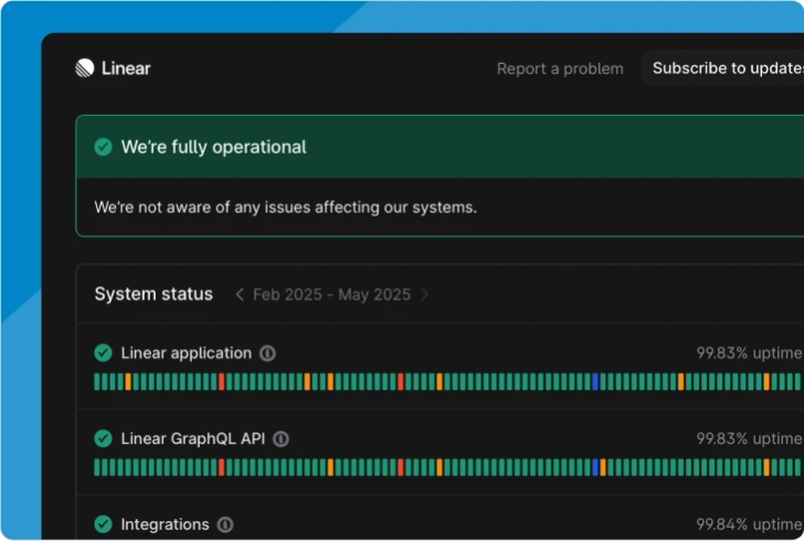
Sorry™ status page metrics

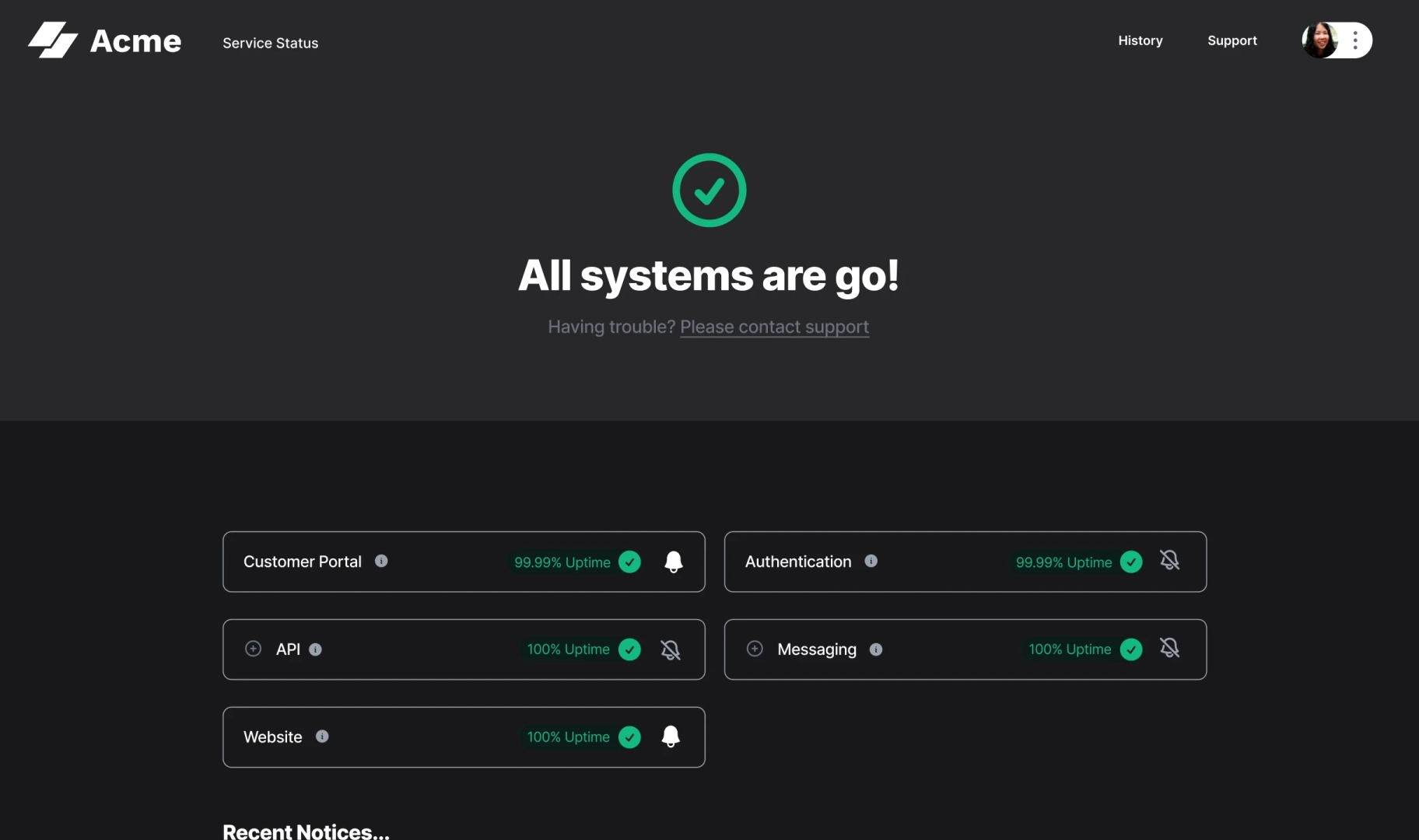
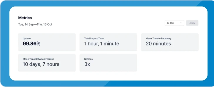
Sorry™ allows you to show component uptime on any component you enable it for. We take metrics further by allowing your status page viewers to drill deeper and see other metrics like MTTR, Total Impact Time, MTBF, and the number of notices (incidents) over time.

We align our metrics with standard ITIL and ITSM KPIs, ensuring the most advanced incident management teams can showcase the metrics that matter most to them. To learn more about using metrics in Sorry™, read our guide.
Atlassian status page metrics

Atlassian's metrics are clean and easy to read. However, you're limited to only showing uptime. To show other metrics, you must integrate a monitoring tool. See how Atlassian compares to Sorry™.
Incident.io status page metrics
Incident.io takes a modern approach to displaying system metrics. However, you're limited to uptime. They don't currently support integrations with monitoring tools, and you can't manually add metrics.
Rootly status page metrics
Rootly supports uptime metrics, but it's not possible to show any other metrics, like MTTR or MTBF, at this time.
Use metrics strategically
There's no single playbook for how or when to use metrics; it varies from company to company. If you choose to display metrics, start by showing the most important metrics on the most important components. As your incident management process evolves, surface more metrics as needed.
When you approach metrics strategically, you instill confidence in your customers and build trust.
Sorry™ allows teams to show a variety of metrics with granular control. Want to see how it works behind the scenes? Schedule a demo with us to learn more!
Thousands of companies around the world trust Sorry™
Are you interested in learning how Sorry™ can help you create a status page for your company?