How uptime works: Sorry™ vs Statuspage
Displaying the historical uptime of your services is a great way to demonstrate reliability. Most status page tools let you track uptime, but understanding the details matters: How downtime is measured, how calculations are weighted, and how easy it is to correct mistakes all affect whether your uptime percentage reflects reality.
This is a comparison of how Sorry™ and Atlassian Statuspage calculate and display uptime.
What are uptime metrics?
Uptime represents the percentage of time your product or service was available and operational during a given period. While the concept seems straightforward, the calculation method and how you control these metrics vary significantly across Sorry™ and Atlassian Statuspage. Understanding these differences helps you evaluate whether a tool's uptime reporting aligns with how your team tracks and communicates service outages and reliability.
Functionality comparison
| Feature | Sorry™ | Atlassian Statuspage |
|---|---|---|
| Uptime percentage | ||
| 90-day green chart | ||
| Edit and restore uptime | ||
| Control who can view metrics | ||
| Mean time to recovery (MTTR) | ||
| Mean time between failures (MTBF) | ||
| Impact time report | ||
| Custom date range report | ||
| Audit trail | ||
| Uptime available via API | ||
| Impact time, MTTR, MTBF & impacted incidents available via API |
Enabling uptime metrics
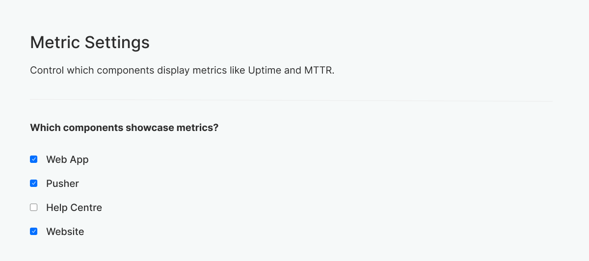
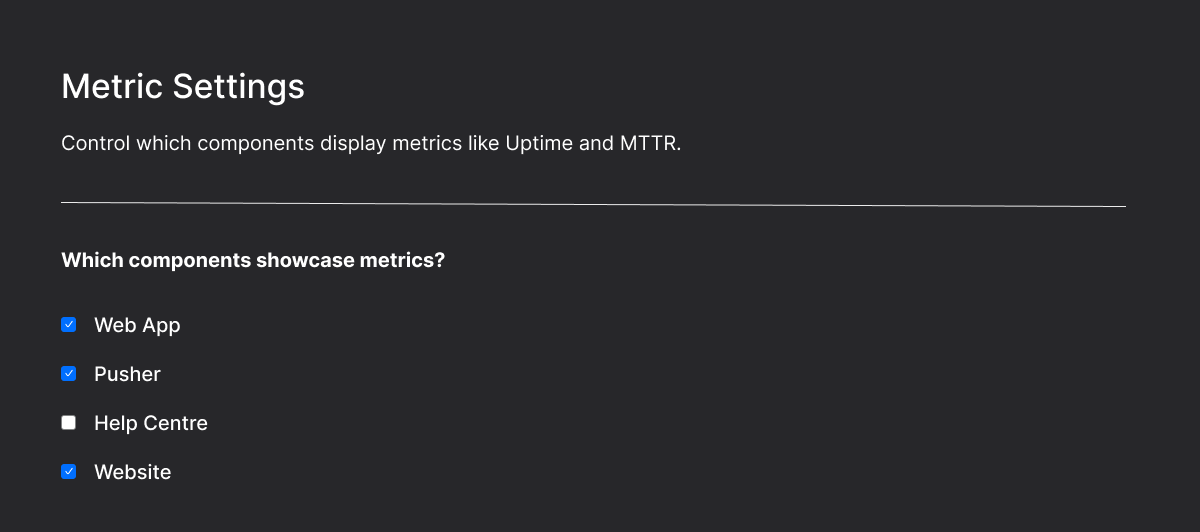
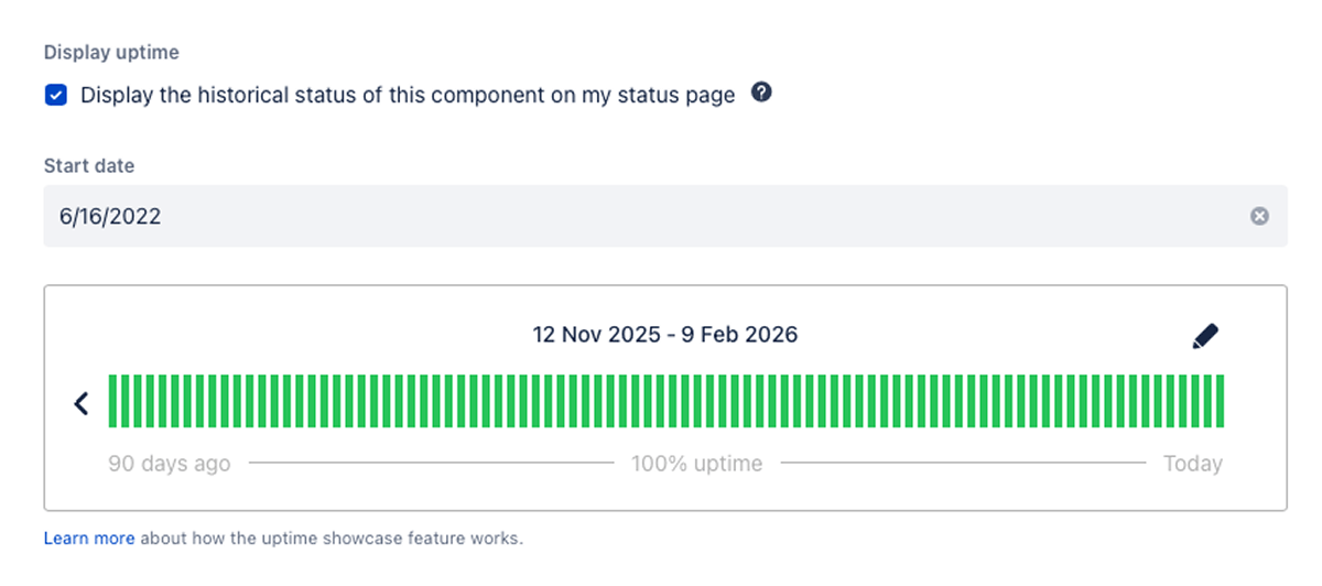
Uptime is an optional metric you can display on both Sorry™ and Atlassian Statuspage. You can turn on uptime metrics at the component level in each tool. All plan types support this feature on both products.
Sorry™
Atlassian Statuspage
How Sorry™ calculates uptime
Sorry™ calculates component uptime using what we call notice impact time. This is the duration between opening an incident notice and marking it as recovering or resolved. The impact time, divided by the total time in a given period, determines the uptime percentage.
Here's the formula:
For parent components that contain multiple child components, Sorry™ calculates uptime as the average of all child component uptime percentages. For example:
If you have a parent component called "Email Services" with three child components:
- SMTP: 99.9% uptime
- IMAP: 99.5% uptime
- Webmail: 99.8% uptime
Sorry™ calculates the parent "Email Services" uptime as: (99.9 + 99.5 + 99.8) ÷ 3 = 99.7% uptime
How Atlassian Statuspage calculates uptime
Statuspage calculates uptime using a weighted measurement based on the component statuses. When a component is in a major outage status, it's weighted at 100%. For partial outages, it's weighted at 70%. They also consider the duration a component is in one of those states.
Here's the formula:
Displaying & viewing uptime
How uptime is displayed to your customers and end users affects their experience with your product and team, and ultimately your brand. The key is presenting this data in a user-friendly way that builds trust.
How Sorry™ displays uptime
When you enable uptime in Sorry™, the uptime percentage is displayed directly on the component.


Clicking the uptime percentage on a component presents a view of the uptime history and other detailed metrics.
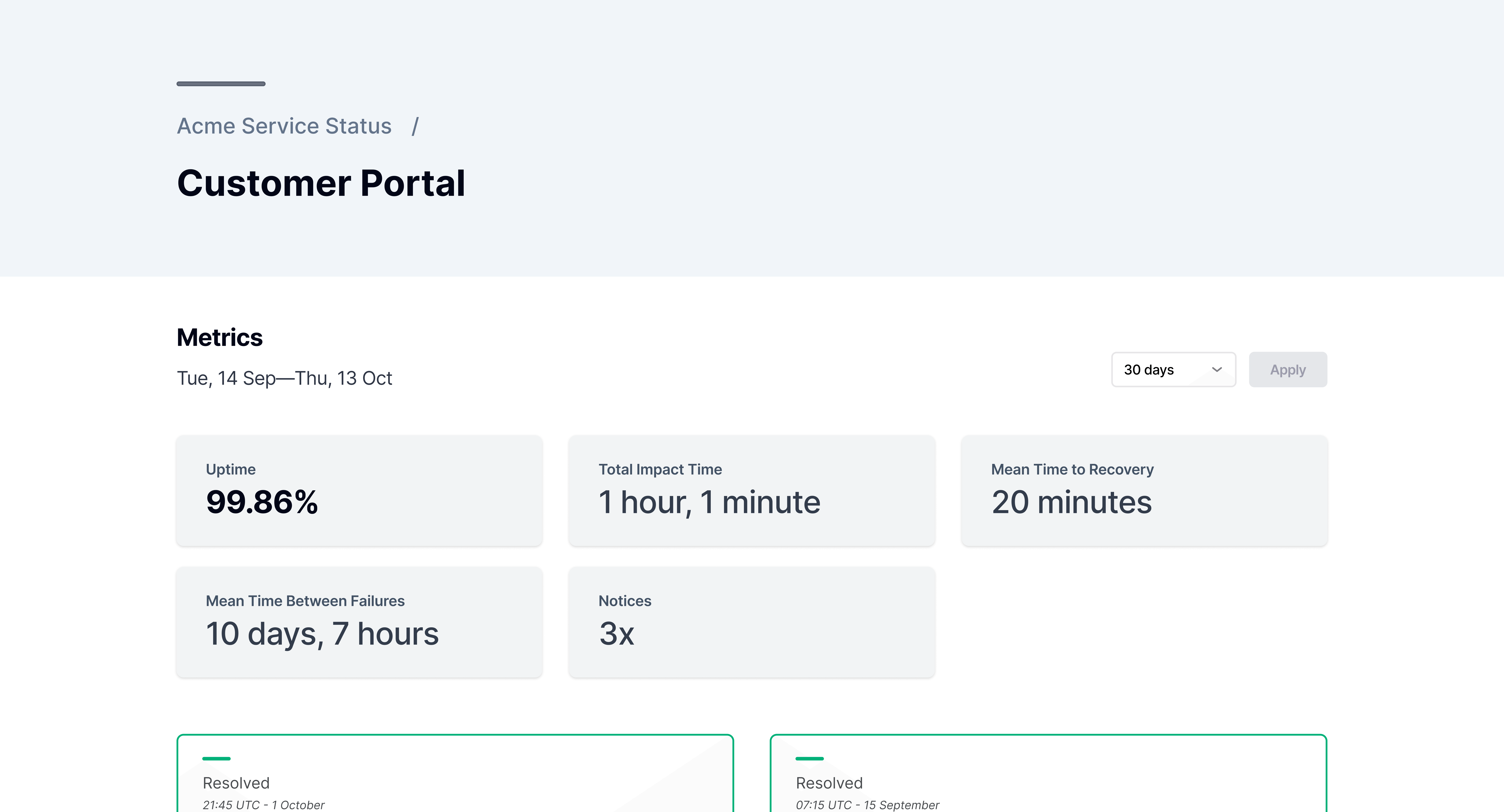
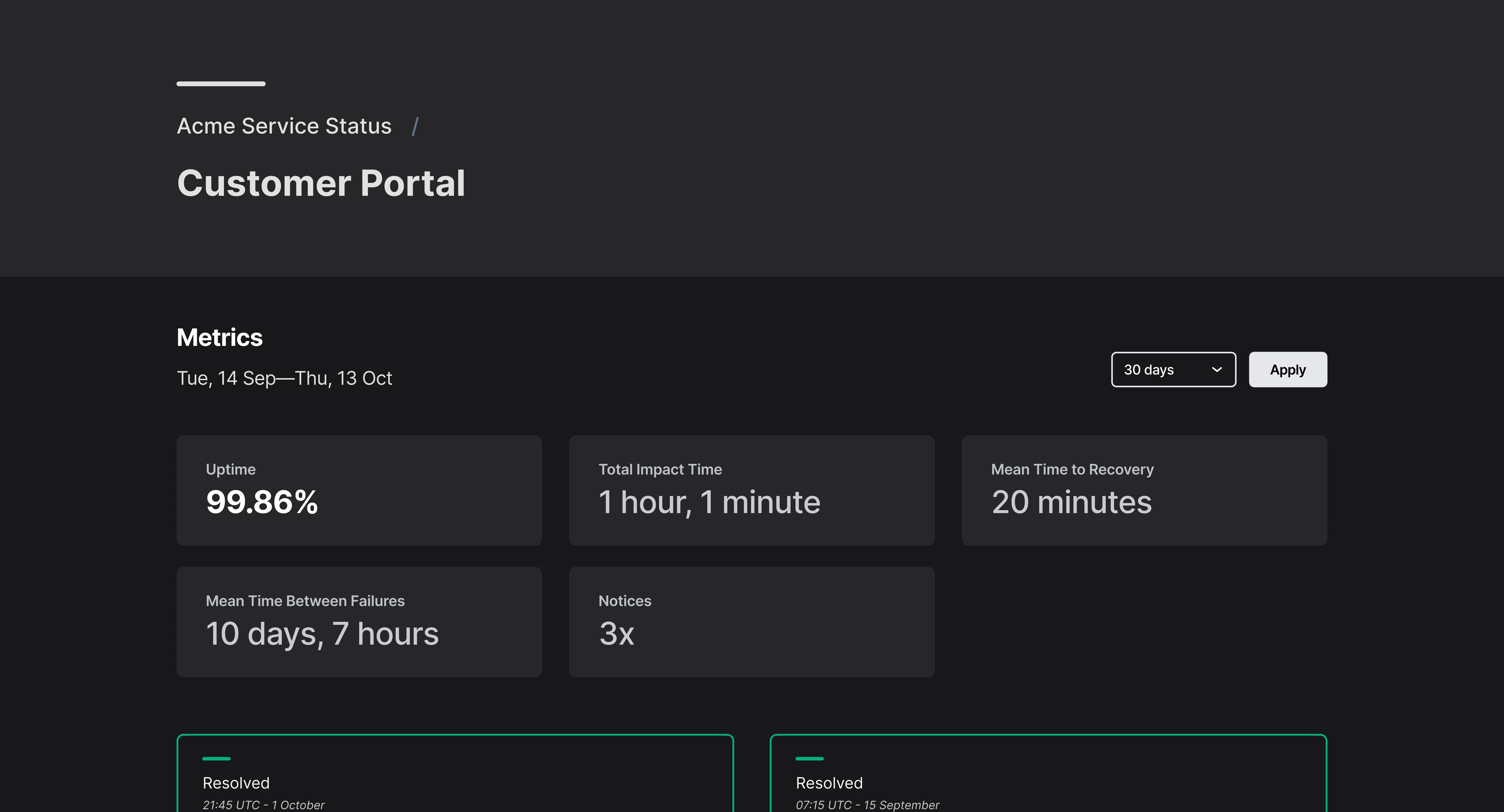
Here, you see the historical uptime, total impact time, mean time to recovery, mean time between failures, and the number of notices during the selected time period. You can change the time period to see metrics for a shorter or longer period.
How Atlassian Statuspage displays uptime
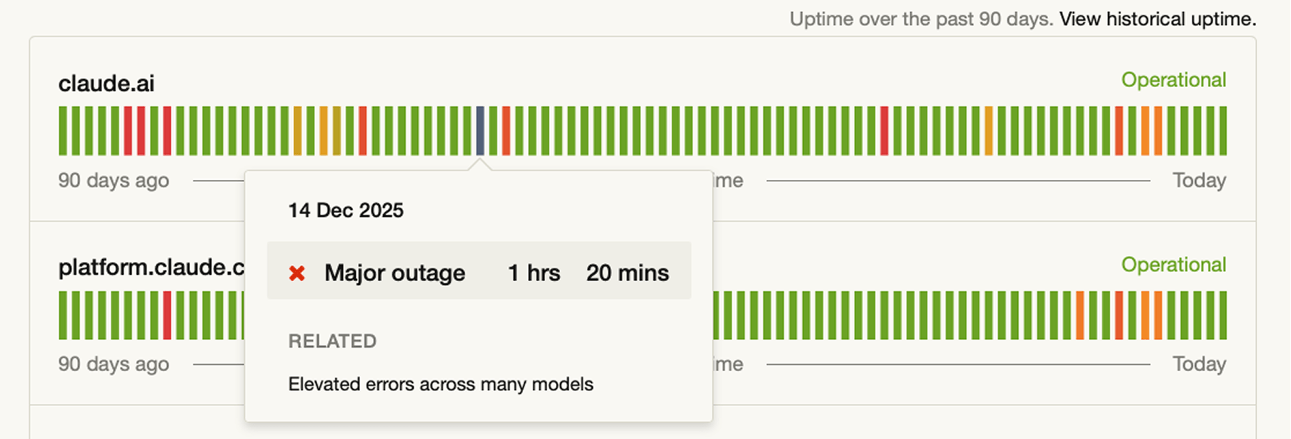
Statuspage shows a 90-day history of the component's status, along with its uptime percentage. Hovering over a day where a component was in a partial outage or major outage state shows you the duration it was in that state, as well as related incidents that day.
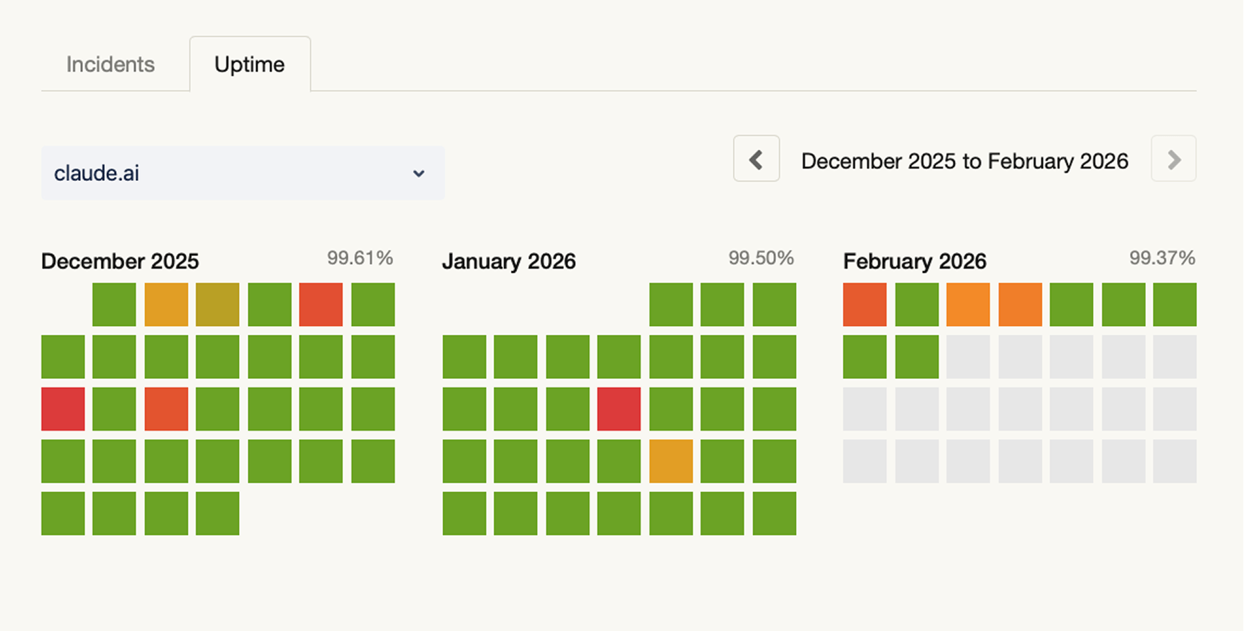
A full history of component uptime can be found by clicking "view historical uptime" from the main status page view. Here, Statuspage provides a month-by-month view, highlighting days with service disruptions.
Controlling who can view uptime metrics
Uptime data can be sensitive. You might want to share detailed reliability metrics with enterprise customers while keeping them hidden from the general public. Or you might need to restrict metrics to internal teams on a private status page while keeping the overall page status visible to partners.
How Sorry™ handles metric visibility
Sorry™ offers audience rules so you can control exactly who can see uptime metrics on your status page and through the page API. You can set conditions based on individual email addresses or entire domains to segment visibility. This works on both public and private status pages, giving you granular control over sensitive reliability data.
How Statuspage handles metric visibility
Statuspage takes an all-or-nothing approach. Uptime metrics are either visible to everyone who can access your status page, or they're turned off entirely. There's no native way to show metrics to specific subscribers or domains while hiding them for others.
Overriding automatic uptime calculations
Uptime calculations are only as accurate as the data they're based on. If your team restored service at 2:15 pm but didn't mark the incident as resolved until 3:00 pm, your uptime percentage will reflect 45 extra minutes of downtime that didn't actually occur.
The reverse also happens: if you close an incident prematurely while troubleshooting continues, your uptime percentage won't reflect the actual uptime.
Both Sorry™ and Atlassian Statuspage allow you to manually correct these discrepancies to keep your uptime metrics accurate, but the experience is different.
How Sorry™ handles overrides
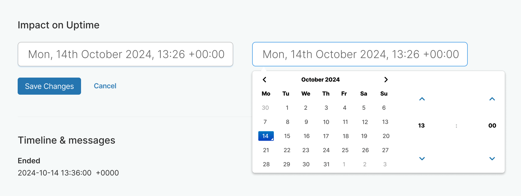
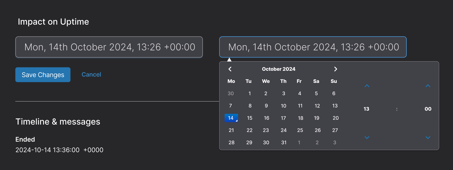
Because Sorry™ uses impact time to calculate uptime, you need to edit that directly within the incident notice window. You can adjust the start and end timestamps of the incident itself, which automatically recalculates the uptime percentage. Every edit is logged in an audit trail showing who made the change and when.
How Statuspage handles overrides
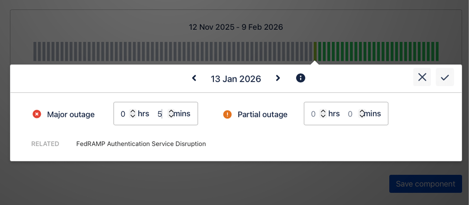
Atlassian Statuspage handles corrections at the component level rather than the incident level. You navigate to the component's settings, select the specific day to modify, and manually adjust the hours and minutes for the major or partial outage.
Changes appear immediately on your status page, but the connection to the original incident is indirect: you're editing component state duration, not incident duration.
A fresh take on uptime metrics
When we designed the uptime feature for Sorry™, we intentionally avoided the stacked green bars and overly complicated calculations that have become the standard across most status page providers. Instead, we focused on building something more useful: a straightforward metric that accurately reflects when your services were down, with flexibility so you can always ensure your uptime numbers are correct.
The result is uptime tracking that's tied directly to your incident timeline, with built-in metrics like MTTR and MTBF that give you (and your customers) a complete picture of reliability.
Additional resources
Interested in diving deeper? Check out this recommended content:
Take a closer look at uptime in Sorry™
Interested in learning more about how Sorry™ handles uptime on status pages? Reach out to schedule a demo, or sign up for a free trial.
Continue reading
How incidents work: Sorry™ vs Statuspage